Task Basket Capstone
Springboard UX Design
Identifying the Problem
Part of the Springboard curriculum is identifying a problem that needs to be improved. My big idea [annoyance] is organizing and managing projects as a creative professional. I would consider myself a generally organized individual, but there are just so many large and small details to keep track of. I have worked in corporate, agency, non-profit, and freelance environments and have noticed some similarities across the board.
Research Phase
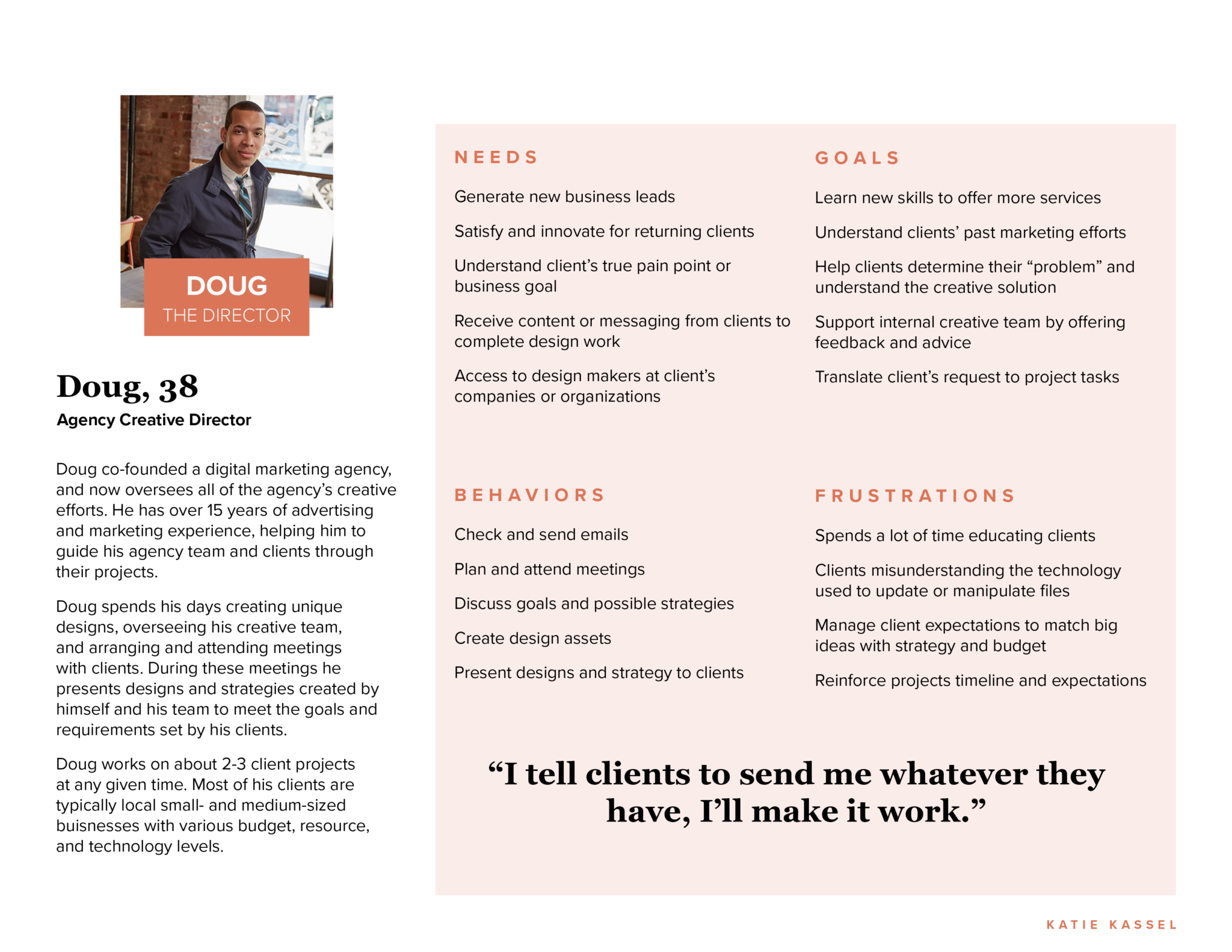
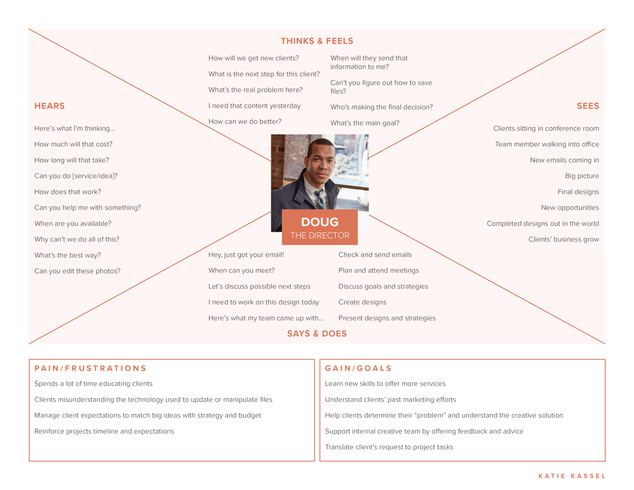
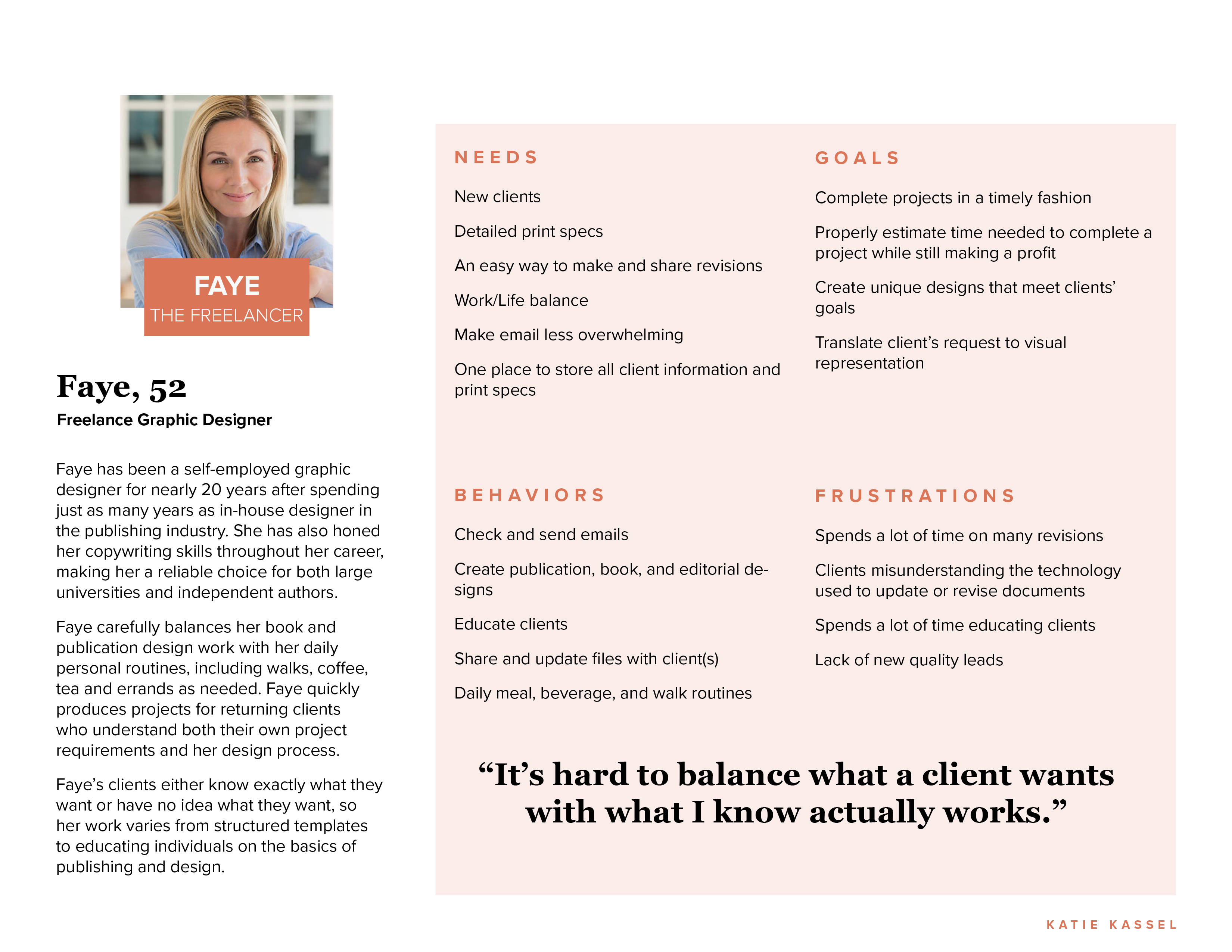
The first step in my UX Design course required learning about the role of a UX Designer. Companies and organizations often have their own expectations of user experience designers so it was helpful to understand the scope of work a UX designer might be asked to perform. After defining a problem I was experiencing–client and project management– I set out to gather the information and experiences of other designers. I began by writing a screener survey to recruit people I could later interview. After gathering responses, I had the opportunity to hold phone interviews with four participants who held positions as Creative Director, User Experience Designer, and Freelance Graphic Designer. Each creative professional shared details of frustrations they experience while managing their creative clients and projects.
Design Phase
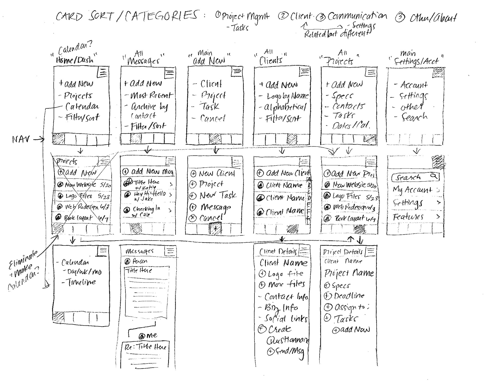
After carefully reading and digesting the responses from my phone interviews, I began organizing the information. I started by creating a spreadsheet to group similar responses and determine features needed to develop an MVP. Then I conducted a digital Card Sort activity to help me better understand how certain user tasks should be grouped. These two important pieces of data help me start visualizing how users might navigate my app. Sitemaps turned to sketches turned to refined wireframes moved to digital wireframes and so on. Towards the end of the design phase, I decided on a name, logo, and visual language for my app.
Testing Phase
Following the design phase, I finalized my wireframes and created a working prototype using Sketch and Invision.
Understanding Users
After deciding I wanted to dig into project management for creative folks, the next step was asking other designers what types of headaches they encounter, if any. I began my research by collecting screener surveys and conducting four phone interviews based on the results of those surveys. Turns out, creative pros in many different settings experienced similar pain points. After pouring over my notes, I started to see a few patterns emerging which would help inform the functions and features most helpful to a creative a professional. I used develop user personas to help me stay focused on the experiences, needs, and attitudes of the creative folks who might use my application.
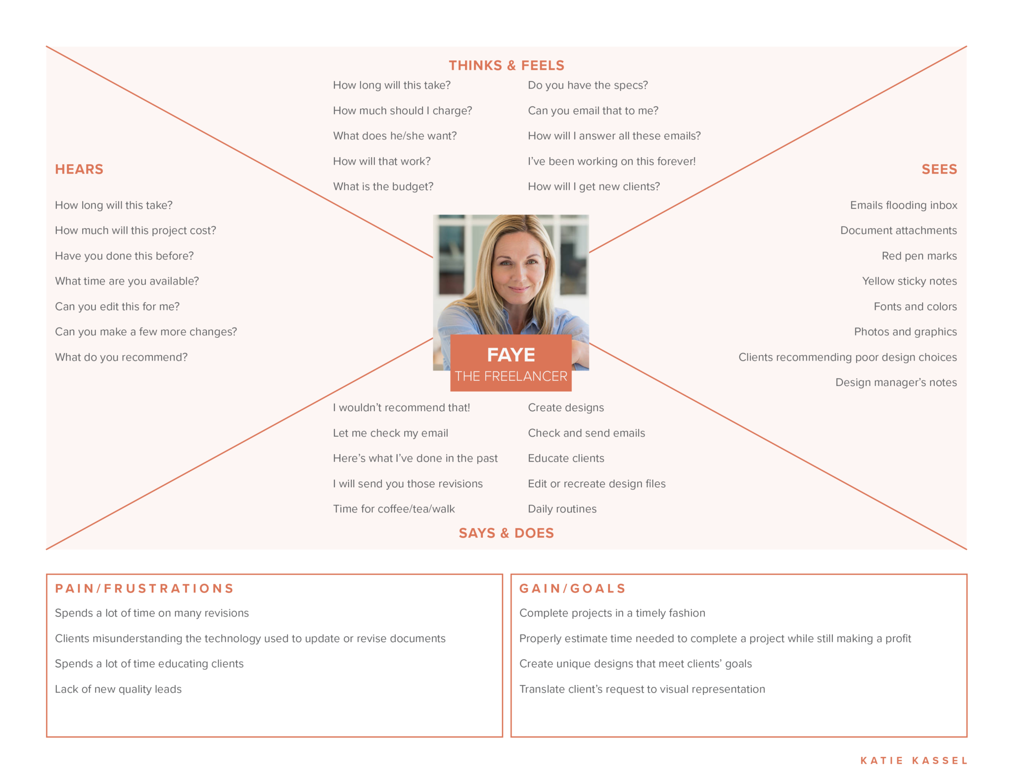
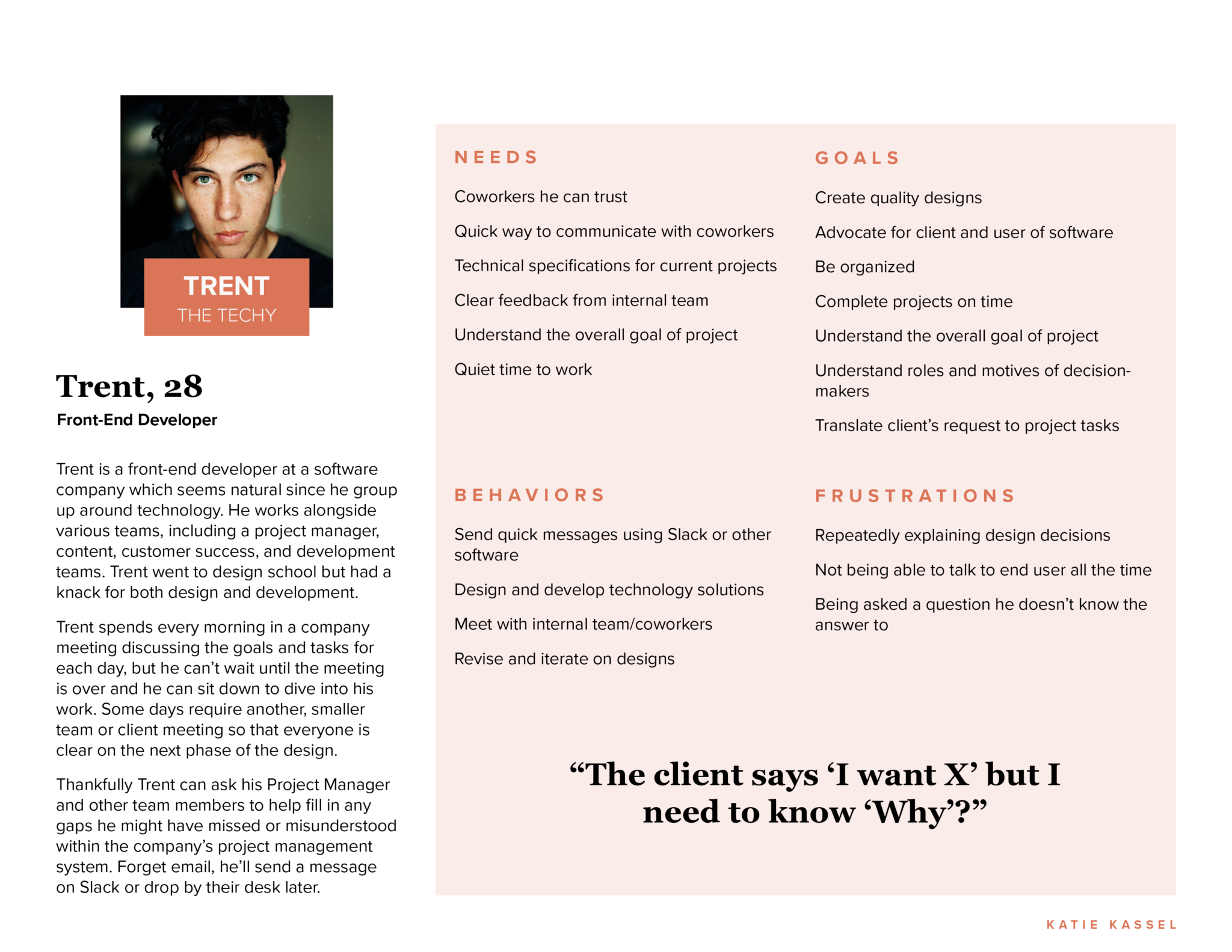
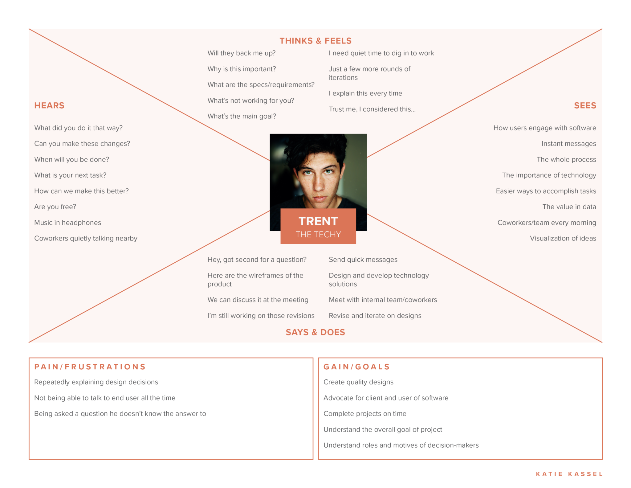
Shared Painpoints
Implementing Feedback
- Need to collect feedback from clients to gage the success of project(s)
- Struggle to organize feedback and communication
- Make feedback into actionable tasks
Tracking Time
- Interview participants care deeply about maintaining timelines
- More accurately track time to complete their work
- Use tracked time to better plan and charge for future projects
Keeping It Together
- Organize all information and keep in one place
- Wading through multiple email inboxes is too confusing and time consuming
Wireframe of Mind
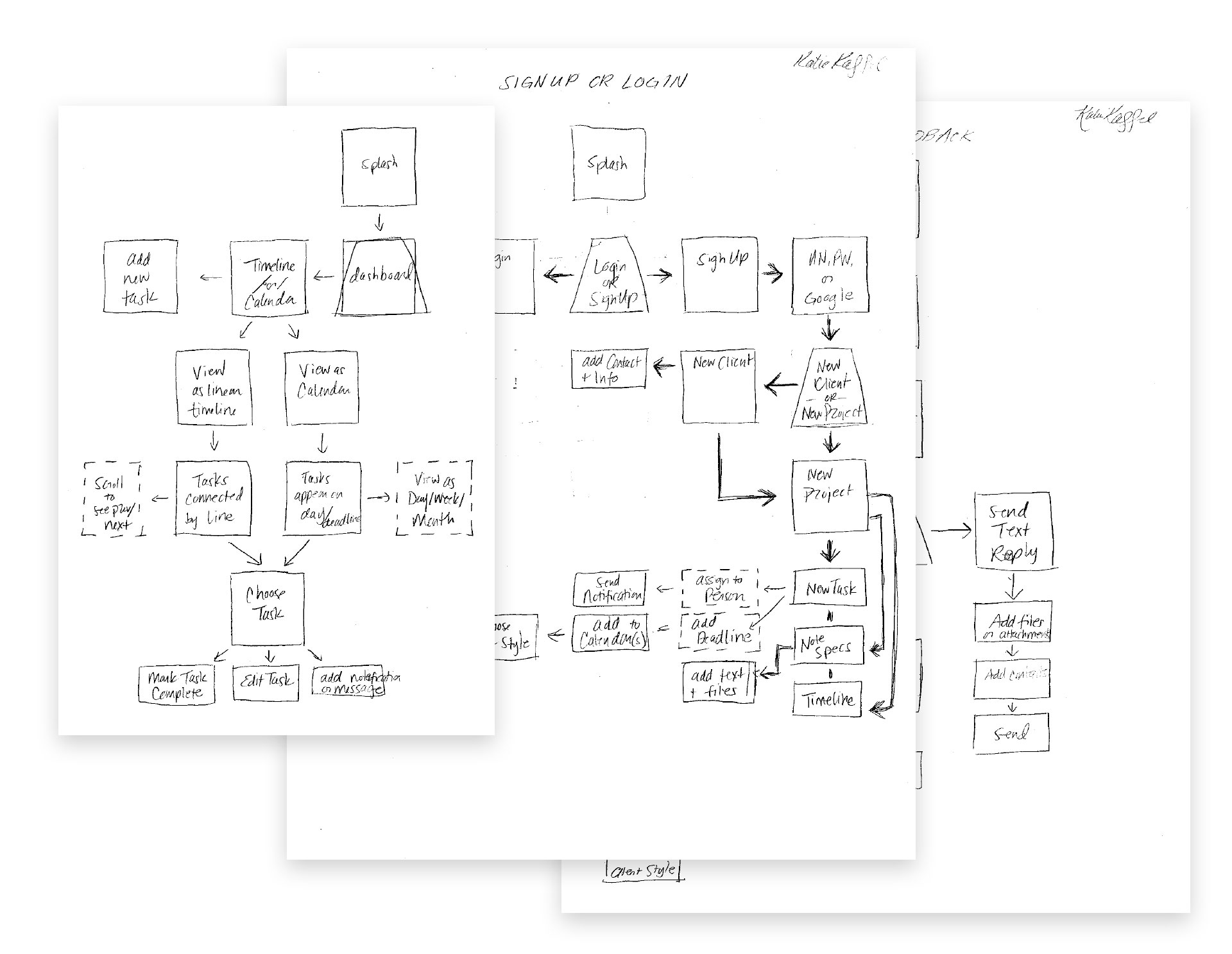
Basic Sitemap Sketches
I used paper and pencil to draw out my initial sitemap for the application. This helped me better grasp the order in which users might navigate the app.
Paper Wireframes
I continued using paper and pencil to flush out how many screens I would need for this app and what should be on each one. This method kept the pressure low since I was focused on content, not design.
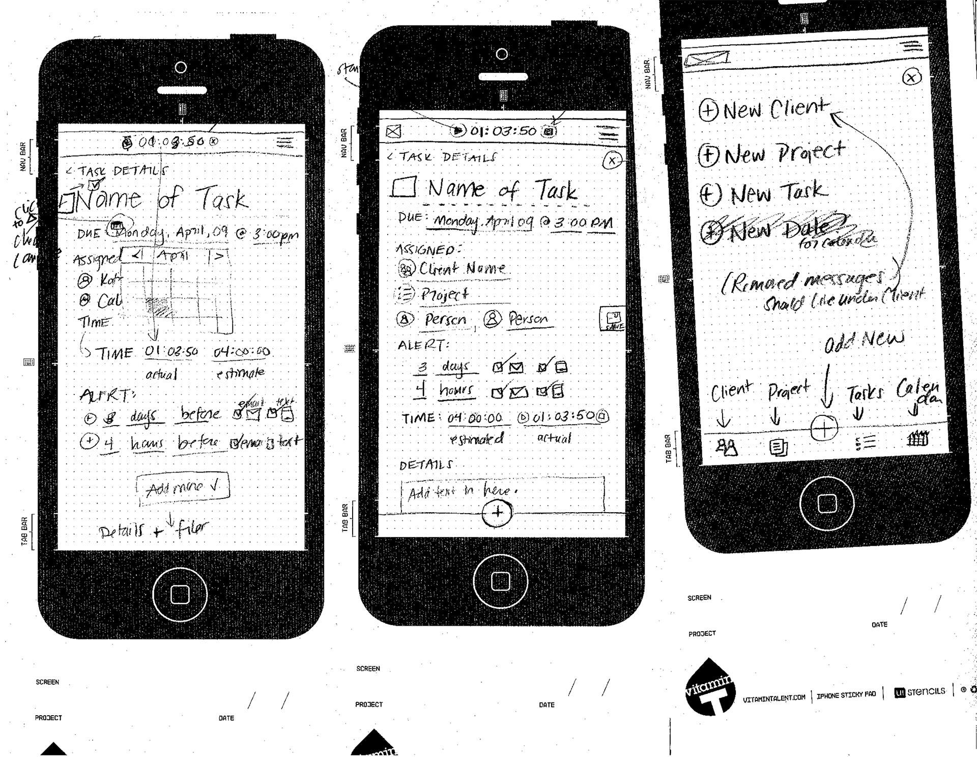
Refined Sketches
I moved to paper iPhone wireframes to drill down on the spacing of my screens and consider features. These frames were sticky notes that allowed me to easily change up the order of screens.
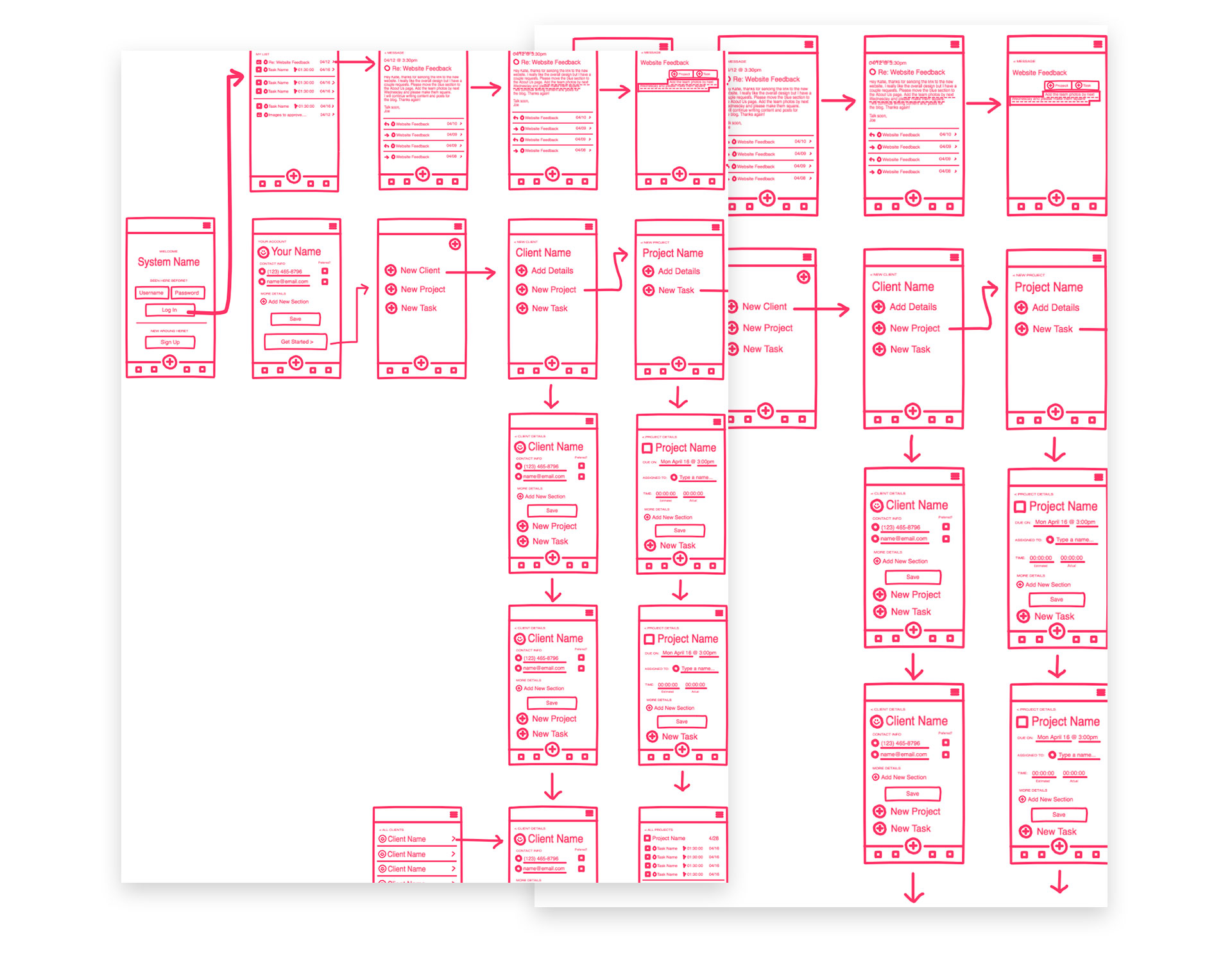
Sketch Freehand
Using Sketch’s Freehand tool to move my drawn wireframes to a screen, I was able to quickly create, duplicate, and build out each screen of the app.
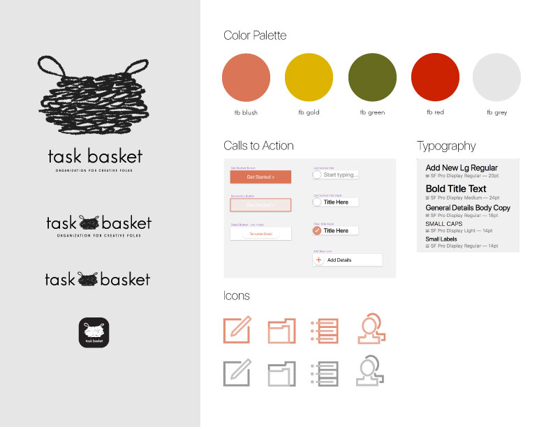
Form Meets Function
After exploring many name options for this application I landed on Task Basket. This name communicates the goal of this project: a way to organize project details. My target audience includes creative professionals ranging from graphic designers, makers, etc. I wanted the branding and aesthetic to feel handmade yet polished to reinforce the skills and care with which our users craft their products and services. Colors were also kept earthy and muted to allow clients’ images and logos to visually steal the show within the app.
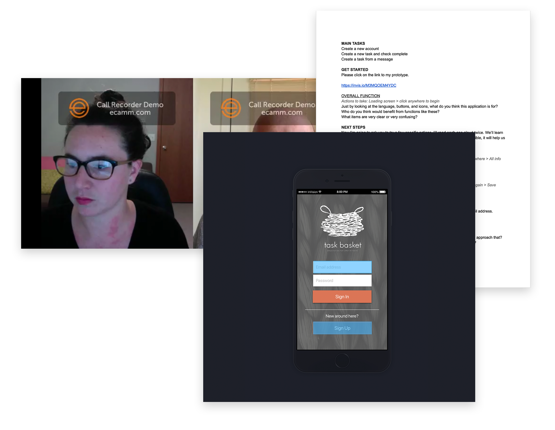
Usability and Testing
After designing and prototyping phases, I held video calls to test the usability of my app with feedback from real humans. I connected with volunteers using Skype and a screen-recording software so that I could record our dialogue throughout the test. I guided users through the following tasks:
- Sign in as a brand new user
- Create a new client, project, and task
- Mark a task complete
- Create a task from a client message
Testing Highlights
Visuals
- Aesthetics and visuals were well received, especially the app name and menu icons
- Users had no trouble discerning buttons and other clickable items
- The name and branding clearly communicated the goal of the app
Functionality
- Some screens, like Add Details and Task Complete, looked too different from the users’ previous step and caused some confusion
- Users requested more animated “hints” in place of additional clicks or screens
- Menu icons, edit icons, and buttons functioned as users expected
Tasks Completed
- Users found the sign-up process straightforward and familiar
- Some “example” completed screens skipped over steps that confused users
- Different users associated different shapes with “marking something as complete”
- The testing phase reinforced how valuable user feedback is in designing a product